Monday, July 20, 2009
Sunday, July 19, 2009
e-Wallpaper New Background -ORANGE
The orange colour had been chosen because it will make the viewers more attracted to view the e-Wallpaper because it shows the cheerfulness of the FOM's students, the lecturers and the staffs with the brighter colour..(FOM- It's hot) ...
Hopefully, the viewers out there will come and join FOM and at the same time enjoy the happy environment at the Faculty of Management...Welcome to FOM!!!
Saturday, July 18, 2009
e-Wallpaper Progress 5
I would like to choose a colour that looks brighter and hot to show that FOM is one of the nice place to study and full of cheers.
Wow, this can represent a good image for my FOM..Hehe..
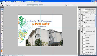
Then, I choose a curly layout and create the font and choose the colour of the background which are purple, green, and yellow..But I am still thinking for the best colour...Whether, Green or Yellow...Green is not suitable erm, let say Yellow...I don't think so...Hah, probably I will choose an orange because it show a hot and cheerfulness...Yeah..:-)
Yes, done with my new background for my e-Wallpaper.
Friday, July 17, 2009
e-Wallpaper Progress 4
Huhu...
Finally, it's come to the final part of the e-Wallpaper progress which are the main content of information for the viewers/ end user..
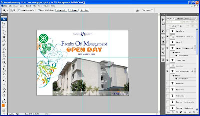
1. Firsty of all, add the FOM word by using the Horizontal Type Tool.
2. Secondly, after typing the word, go for the blending options, select the drop and inner shadow for the layer style.
3. Thirdly, for the fonts option, I've already choose the:
* Palatino Linotype and Curlz MT - Faculty of Management
* Bambina (Took from the Internet) - OPEN DAY
* Trajan Pro - 21ST MARCH 2009
4. Finally, oh yeah...I am also add the MMU motto for my e-Wallpaper which is "Bridging Boundaries, Connecting Minds".
> Click at the Blending Options
> For the Advanced Blending, I'm using R, G & B Channels.
> Lastly, I had select the drop shadow for the layer style.
Thursday, July 16, 2009
e-Wallpaper Progress 3
# To make the Black background, I used the Rectangle Tool to draw a box.
# Then, right click on the Layer and select Blending Option.
# From the Layers Style Windows, decrease the percentage for Opacity, so the box will looked a bit transparent. It will make the details in the box more contrast and easy to read on.
# Use the Horizontal Type Tool to type the "Contact Us" contrast. I didn't not forget to select the font and font size that can be easily to read.
# I am also made it as white colour of font, which it will be contrast with the original background.
# Finally, I used the Brush Tool to draw some curly pattern, so the "Contact Us" part wouldn't to blank.
# Last but not least, I hope that it will attract the viewers out there...
# For the Course Offered Informations, I just made a simple design by typing the "Bachelor Of" in a horizontal style while for the "Course Offered" in a vertical style at the top right corner of the e-Wallpaper.
Wednesday, July 15, 2009
e-Wallpaper Progress 2
1- Firstly, open the MMU and TM file from the reference folder that has been created. Then by using Move Tool or a short-cut key M, drag and drop the MMU and TM logo into the background. Taraaa, new layers is created.
2- Secondly, use the Move Tool as well and drag the MMU logo to the upper center corner while drag the TM logo to the bottom right corner.
3- Thirdly, using the Wand Tool or a short-cut key W, select the white colour background of MMU logo and then delete it same goes to TM logo.
4- After deleted the white background, right click on the layer, then select Blending option. In the blending option, pop up windows, tick the outer glow colour.
5- Finally, the MMU logo is glowing at the center of the e-Wallpaper while the TM logo is glowing at the bottom right corner of the e-Wallpaper.
Tuesday, July 14, 2009
e-Wallpaper Progress 1
Hopefully, I can explained a little bit about my assignment progress and hopefully I'll get a useful comments from you all, please share your tips with me.
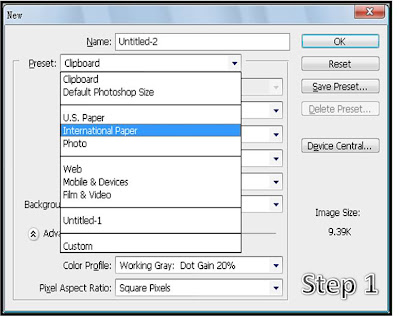
1. Create a new file by pressing ctrl+N.
2. Then choose A4 size, from the Preset, choose International Paper.
3. At the size there, I had chosen an A4 size.
1- A blank of white colour background has been appeared on the screen.
2- I would like to add something on it. Yes, of course a new design for my new background which is blue but ermm, blue mostly had been chosen by my other peers. So, I just keep remain the white colour as a background.
3- Basically, a picture of newly built main building of FOM has been taken for my e-Wallpaper. Open the FOM Building image file from the Reference folder. In the new image File, right click on the layer, Duplicate layer.
4- So, I can drag and drop the layer into the e-Wallpaper image.
5- Alright, now by using Move Tool, drag and drop the FOM Building file into the e-Wallpaper image.
6- The image seems too big in the e-Wallpaper image. To resize it, go to the Edit button and then click Transform button, follow by scale.
7- The size of the FOM Building layer can be adjusted freely.
Monday, July 13, 2009
Assignment 1 (15%): e-Wallpaper
Students are to create a digital image as a wall paper. The event or theme is MMU FOM Open day dated March 21st, 2009.
*For the idea and message
*For the use of tools
*For the quality of the digital image
*For the creative / imaginative / design of the wall paper